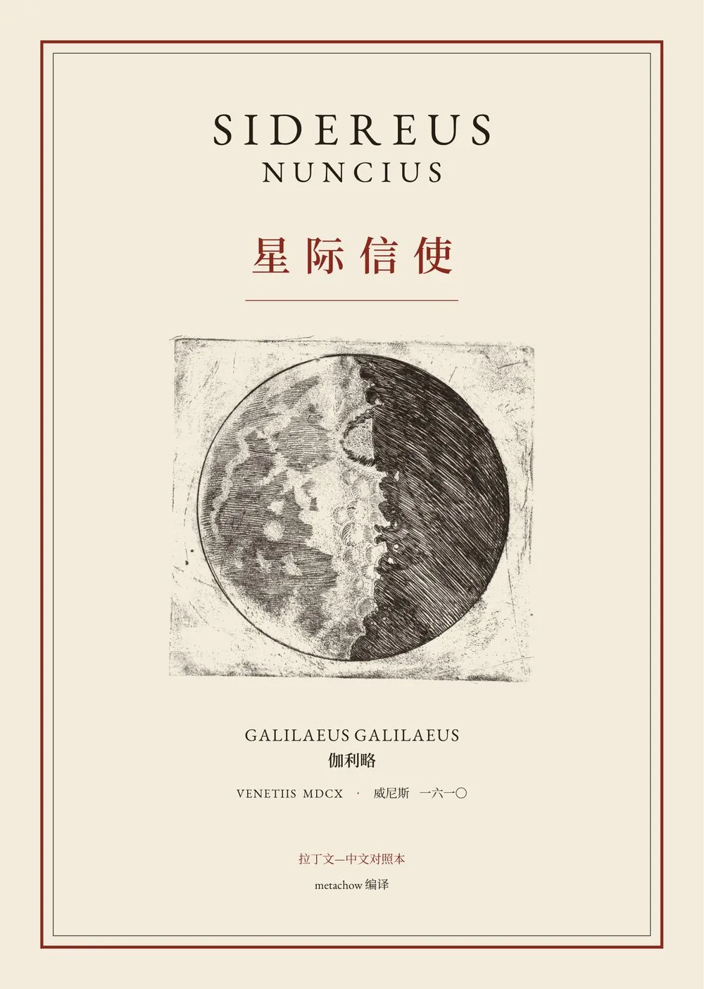
In March 1610 Galileo published a slim book in Venice, the Sidereus Nuncius (The Starry Messenger). He had turned a telescope of his own making to the sky and found that the Moon is not smooth but rough with mountains and craters, that the Milky Way is a mass of countless stars, and that Jupiter has four small companions no one had seen before, moving from night to night. Sixty-odd pages that shook a picture of the heavens two thousand years old.
A while ago I came across the Smithsonian Libraries’ copy of the first edition on the Internet Archive. Looking at its woodcut initials and engravings of the Moon, I wondered: could I re-typeset it with modern tools, faithfully, and add a translation?
That turned into a long project with Claude (Anthropic’s AI). The result is on GitHub at metachow/sidereus-nuncius, and the PDFs can be downloaded from the Releases page.
What it is
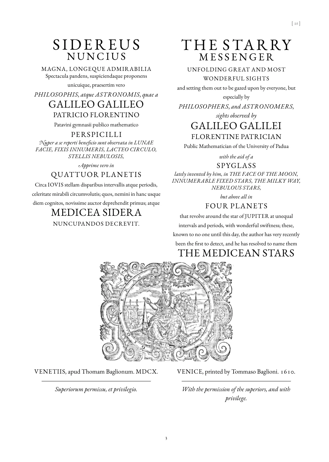
In one sentence: every page corresponds to one page of the 1610 edition. On the left is the Latin in modernised spelling, breaking exactly where the original does; on the right a new translation made directly from the Latin. There are now three editions: Latin–Chinese, Latin–English and Latin–Japanese.
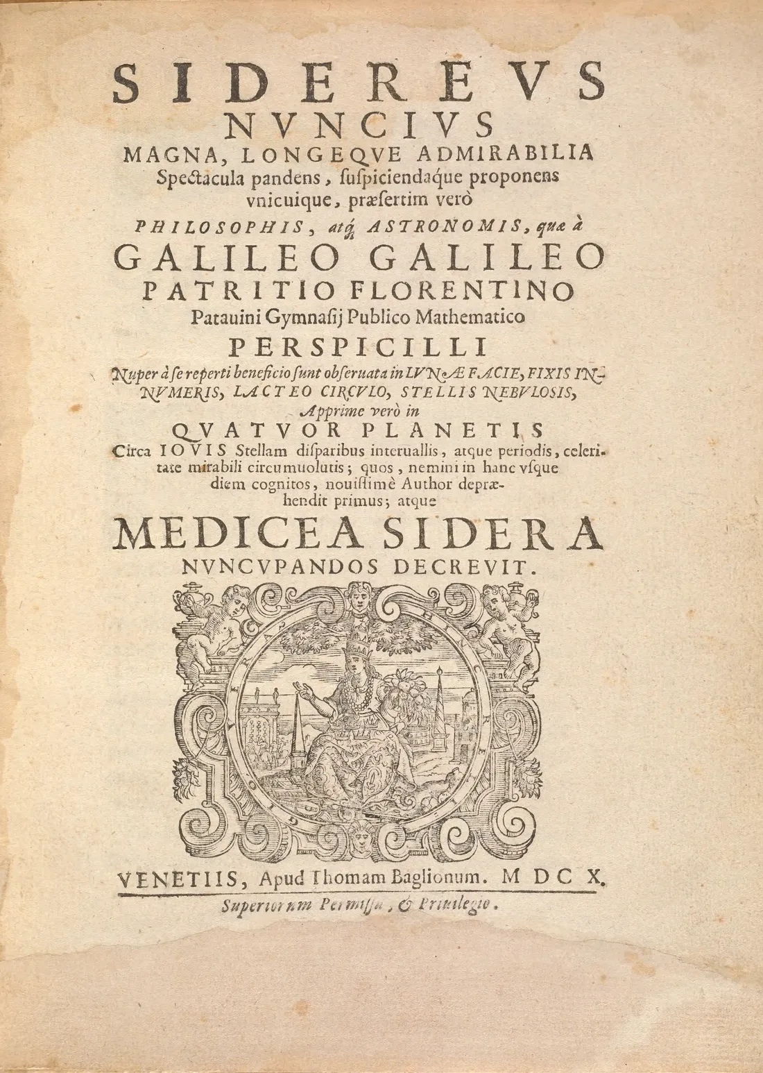
Here is the title page: on the left the raw 1610 scan (not cleaned; the library’s call number is still pencilled in the corner), on the right the new edition. Drag the divider to compare, and use the buttons to switch between the Chinese, English and Japanese editions.
 1610
English edition
The original mixes several kinds of type: roman, italic with swash capitals, letter-spaced capitals for emphasis, and large display capitals. Each kept its role. The Latin is set in EB Garamond, a revival of the 16th-century Garamond. In Chinese the roles map to Song, Kai (for italic) and bold (for the spaced capitals); in Japanese to Mincho, a textbook face, and bouten, the dots Japanese puts beside a word for emphasis.
Starting from the scan
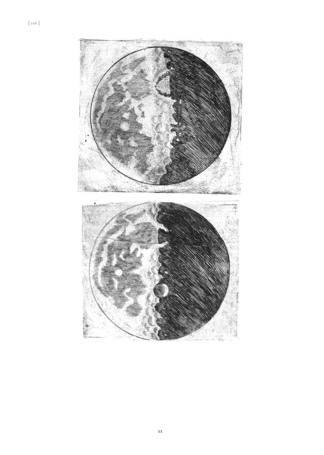
The first trap was the scan itself. The PDF the Internet Archive serves by default uses MRC compression, which keeps the text legible but turns the fine hatching of the engravings to mush. The original JP2 images in the archive (about 657 dpi) were the real starting point.
Removing the yellowing needed nothing fancy: fit a smooth surface to the colour of the paper and divide it out, and the ink is what remains. We deliberately did not use AI super-resolution on the engravings. It invents lines that look sharper but that Galileo’s engraver never cut, and for a facsimile that is worse than blur. Where a fold crossed a Moon plate, the crease was patched with blocks copied from intact areas nearby.
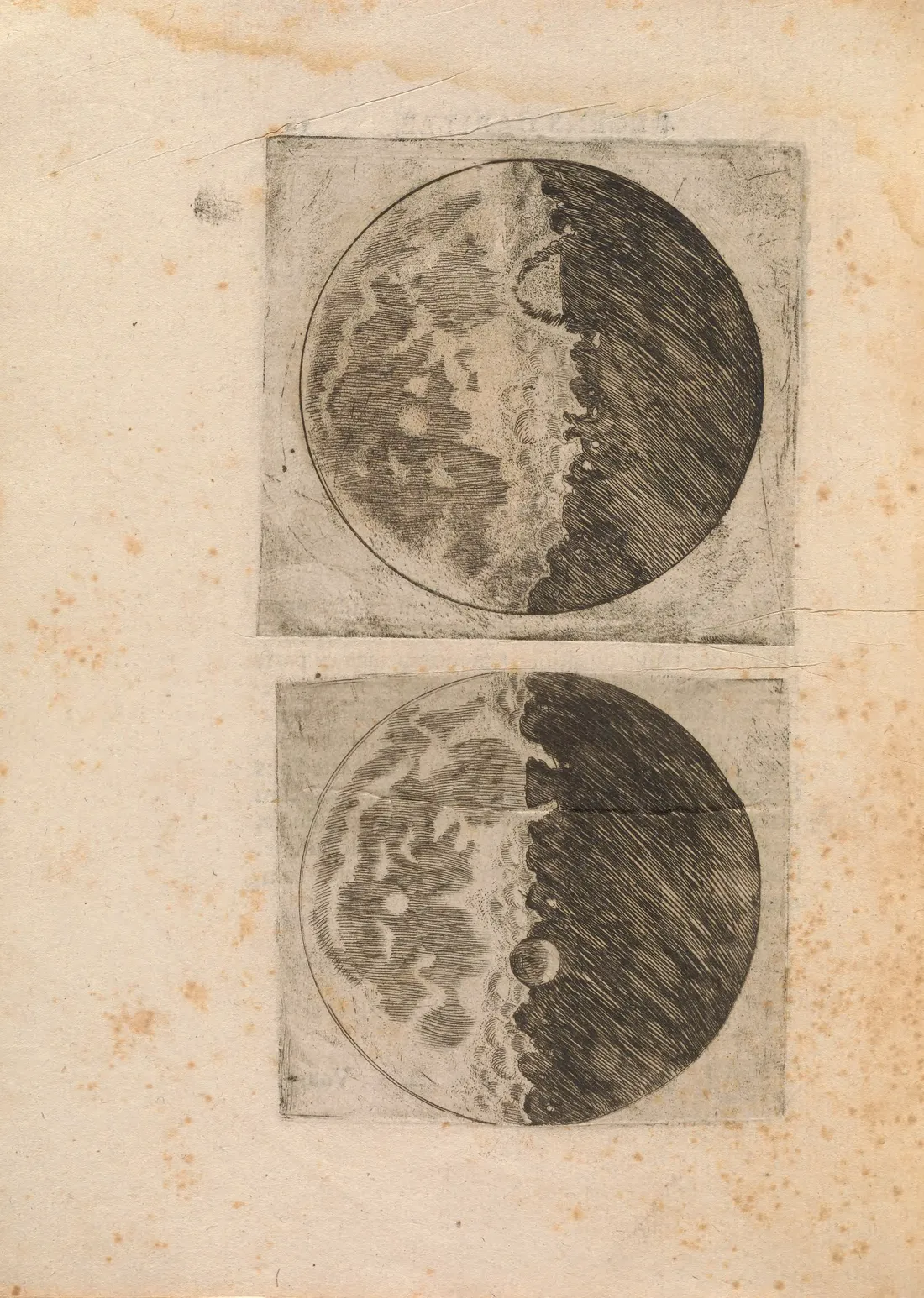 1610
English edition
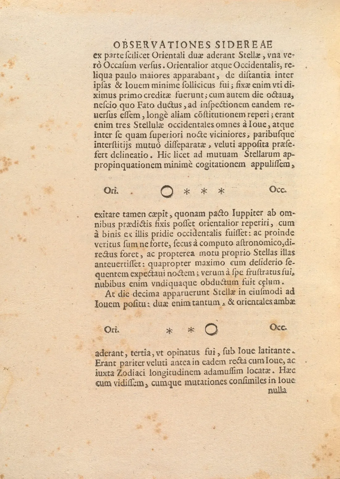
The star maps and the diagrams of Jupiter’s moons were handled differently: every star was measured on the scan and redrawn as vector graphics in TikZ. The star counts match Galileo’s text, and the old stars are drawn as large double-outlined stars and the new ones as small single-outlined stars, as in the original.
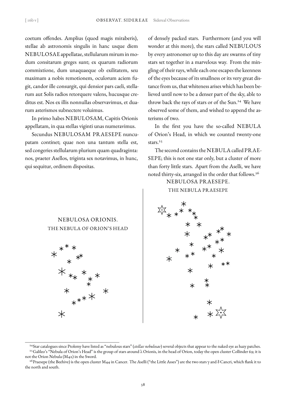
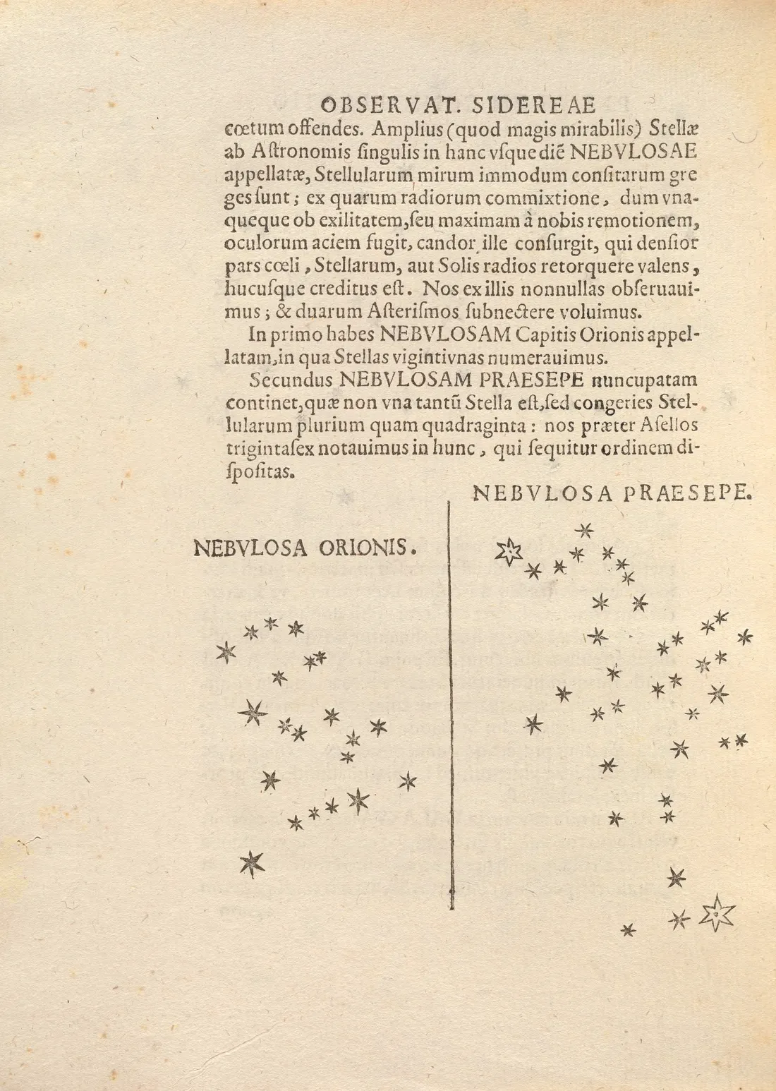 1610
English edition
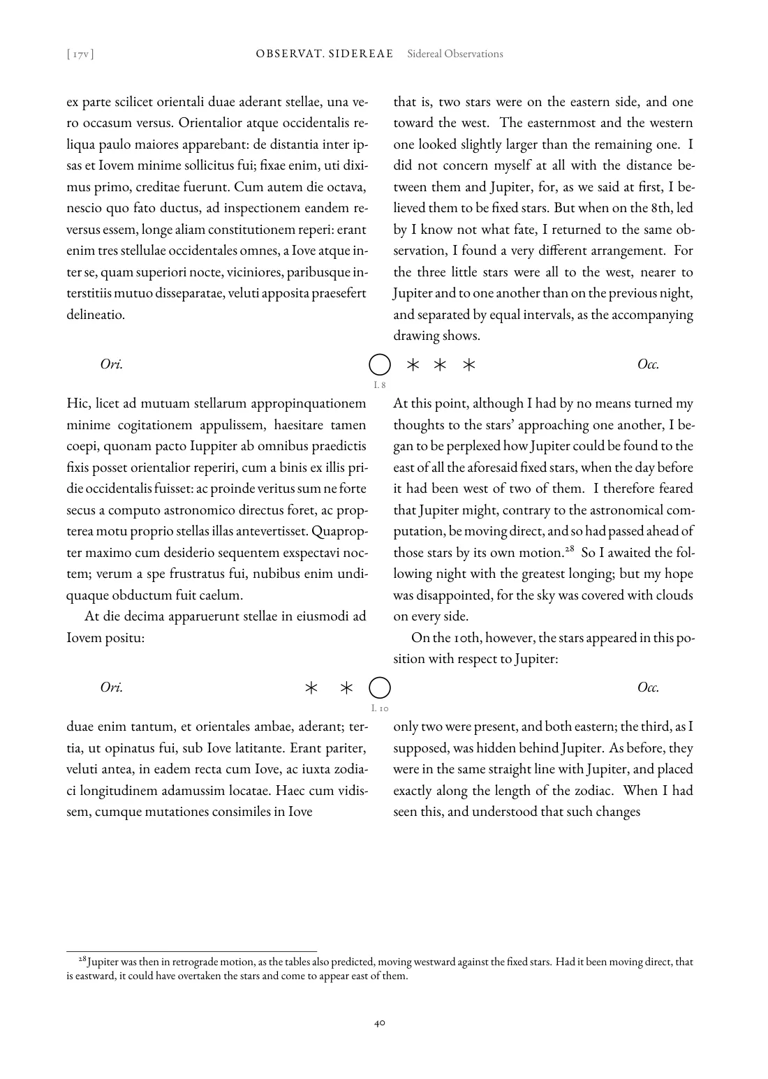
 1610
English edition
Text first, pages second
At first we wrote the LaTeX page by page, and it quickly became hard to maintain: changing one sentence of the translation meant finding which page file it had landed in. So I suggested turning it around: get the text, translate it, and only then deal with page breaks. The Latin went into a YAML file, numbered by paragraph and sentence (81 paragraphs, 315 sentences), with the original’s page breaks marked inside the sentences as ⟦8v⟧. Translations are stored sentence by sentence under the same numbers, and the page files are generated by a script, never edited by hand.
This paid off later. Adding the English and Japanese editions was essentially “translate 315 more sentences”; the script did the layout.
Translation: AI translates, AI proofreads
The translations were made by Claude subagents: Sonnet translated, five agents working on five parts at once; Opus proofread, sentence by sentence against the Latin. One rule was non-negotiable: translate directly from the Latin, and never consult or reproduce a modern translation still in copyright.
Proofreading turned out to be far more valuable than I expected. In the Japanese edition alone Opus made about 140 substantive corrections, for example:
- in the dedication, a misread agreement had made Jupiter “the source of all good”, where the Latin says God is the source of all good and Jupiter comes after him;
- one sentence said the vapour around the Moon “shines by itself”, where the Latin says it is lit by the Sun, which is the opposite of Galileo’s argument;
- two places said “as in the figure above” when the figure comes next.
The proofreaders also raised questions only an editor can settle, such as how to phrase the recurring formulas of the observation log consistently. Those decisions went into a shared rulings file and were relayed to the proofreaders still at work.
None of the three translations has yet been reviewed by a Latinist, and the title pages say so. If you read Latin, issues are very welcome.
Details I cared about
Most of the code, translation and typesetting was done by Claude. What I did most was look, and say “this isn’t right”.
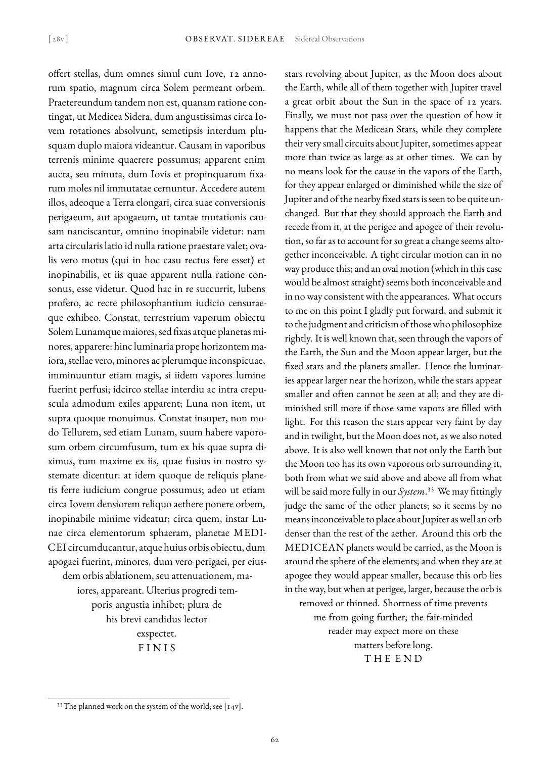
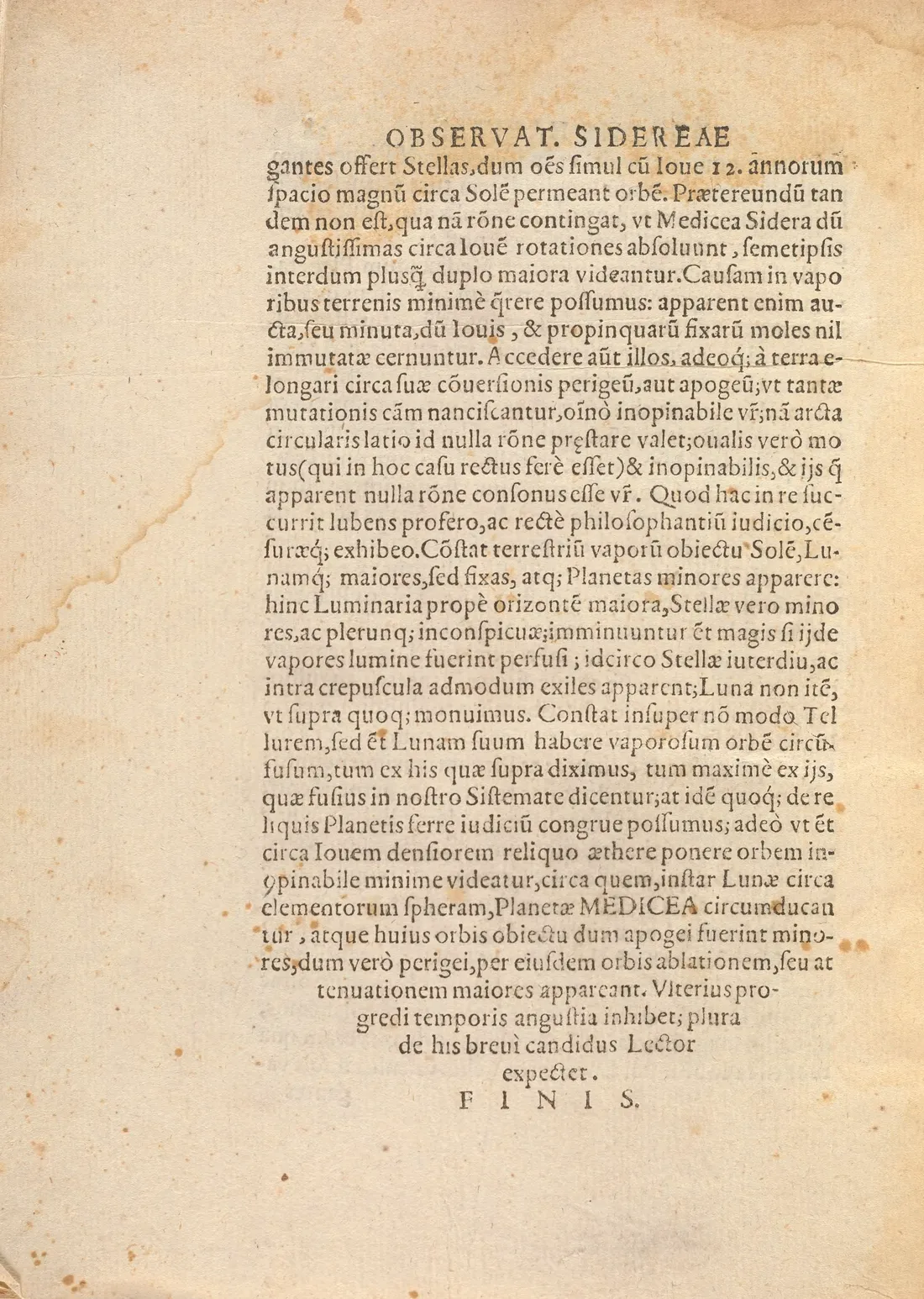
The tapered ending. The last page of the 1610 text ends as an inverted triangle, its last lines narrowing step by step. I asked whether we could imitate it, and Claude wrote a macro that finds by trial typesetting how many full lines to set before the taper. In the first version the point of the triangle was the stray tail of a hyphenated word; in the second the left side lined up but the right did not; only the third really centred the last line.
 1610
English edition
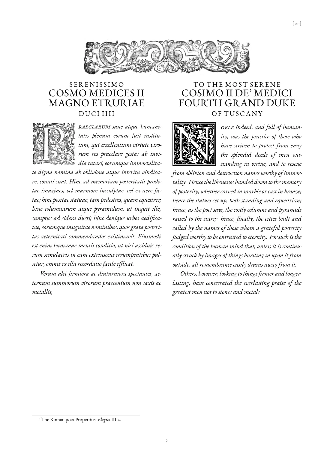
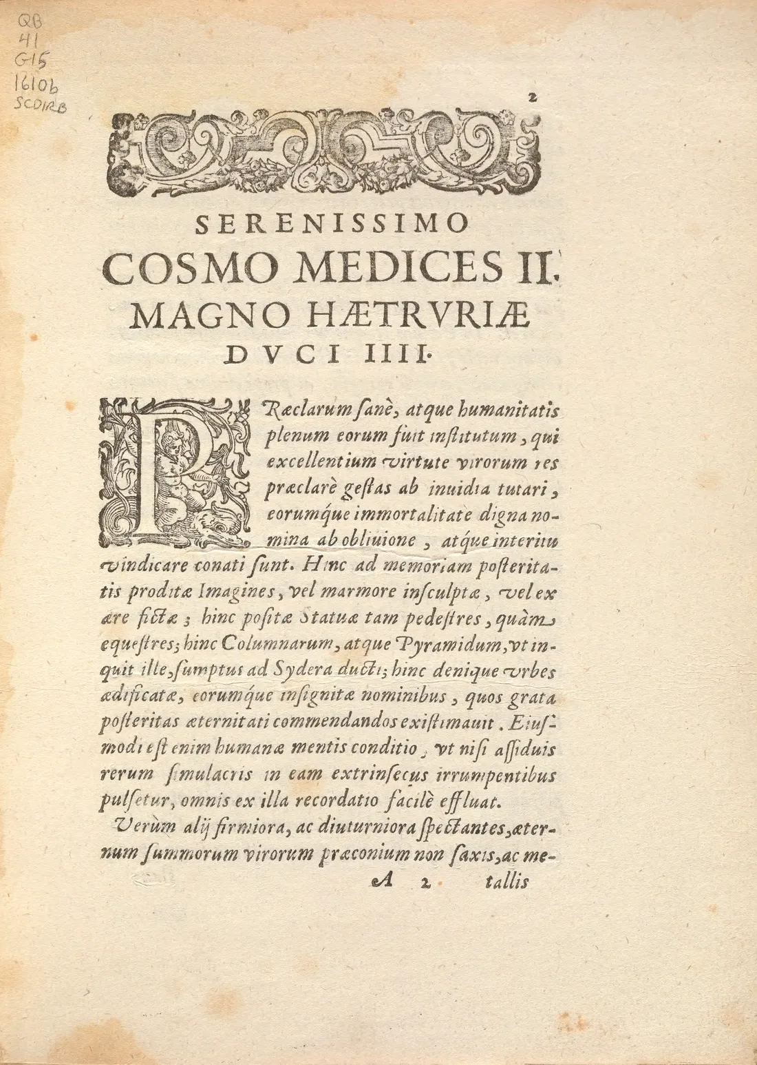
Decorated initials. The Latin uses the original woodcut initials. For the English column we found Goudy Initialen, a decorated-initial font that ships with TeX Live and is built like a Renaissance woodcut initial. Chinese and Japanese have no initial letters, so a script renders the first character as a woodblock: a ruled square, hatched ground, uneven ink, worn edges. At first some were in Kai and the characters looked small. Then I noticed that the Latin woodcut letters are always plain roman capitals filling their frames, so we switched to a bold Song face scaled to fill the block.
 1610
English edition
Page breaks. English word order is close enough to Latin that the English can break exactly where the 1610 page breaks. The first build of the Japanese edition looked wrong after a few pages: many pages began with a blank right column. A sentence running across a page had been placed whole on the earlier page, leaving nothing beside the Latin continuation. Splitting the Japanese at the nearest matching clause fixed it.
Japanese conventions. Kanji outside the everyday set, like 噂 or 論駁, get ruby (small kana readings above) at their first occurrence. Digits in Japanese text use lining figures, because EB Garamond’s default old-style figures look odd in 「1610年」.
Looking back
What surprised me most was how much the AI could do beyond translating: reading scans, measuring star positions, writing LaTeX macros, choosing fonts, laying out pages, cutting a GitHub release. It did all of this well. But judgements like “this page looks wrong”, “the triangle isn’t aligned on the right” or “that blank shouldn’t be there” still needed a person looking at the page. That was roughly the division of labour: it made things, I looked at them.
Afterwards we wrote the whole workflow up as a reusable skill: cleaning scans, the text-first data model, translating and proofreading with subagents, and the typesetting pitfalls. The next book is already under way: Li Yu’s Xianqing Ouji (閒情偶寄), from a Kangxi-era woodblock print, re-typeset vertically following the original’s line layout: metachow/xianqing-ouji.
Links
- Source: github.com/metachow/sidereus-nuncius
- PDFs: Releases
- Scan of the first edition: Smithsonian Libraries, Internet Archive
Sidereusnuncius00Gali - Latin text: A. Favaro, Le Opere di Galileo Galilei, Edizione Nazionale, vol. III (1892)
Translations, notes and typesetting are released under CC BY 4.0, the scripts under MIT; the Latin text and the scans of the 1610 edition are in the public domain.